

Top Ten Modern Minimalist Design Details For A Primary Suite
In a study by Houzz, the modern minimalist style is consistently ranked in the top five bathroom designs chosen by homeowners. In commercial real estate, this style is selected for chic high-end resorts, spas, and luxury hotel suites.
It’s no surprise the modern minimalist style is so popular in bathroom design. Think about the last time you cleaned your bathroom— pretty gross right? Modern minimalism eliminates clutter, making bathroom spaces easier to clean, and elevating them aesthetically.
The benefits of choosing this style for your primary bathroom go even deeper. Let’s take a look at two bathrooms I recently renovated to showcase ten of my favorite minimalist modern design details.
1. Floating Vanity - With Under Cabinet Lighting
If you find yourself wondering what design details are most common in a modern minimalist bathroom, the floating vanity makes the top five most popular features of modern-style bathrooms (via Houzz):
Floating vanity
Glass shower enclosure
Minimalist faucets
Streamlined lighting
Frameless mirrors
A floating vanity has many benefits in a bathroom space. I love their sleek design, how they visually expand a space and make an incredible focal point for the room. When you can see the flooring under the vanity it tricks your mind into thinking the space is larger.

Since this vanity was also built to be the focal point of this room - a lot of time was taken to consider each detail that went into the space around it. Pay special attention to the lighting used to highlight this feature. This is an affordable hack to elevate your vanity. The under-mount accessory lighting is a simple tape light mounted at the back of the bottom of the vanity. When lit up, the floor is washed in light, creating the illusion that the floor space is larger. (It also acts as the perfect nightlight.)
If you want to take a relaxing bath you can dim the lights or only turn on the under cabinet and mirror light on low to create a serene spa-like feel.
2. Wall Mount Faucet
The simplicity of a wall-mounted fixture speaks to me on a deeper level. These wall mount faucets from Brizo have only one control handle, which is integrated into the spout. Not only is the wall-mounted faucet aesthetically cleaner, but they are also easier to clean than traditionally mounted faucets.

If you are planning to install a wall-mounted faucet, plan out the height of the faucet above your sink. If the faucet sits too low, it can be hard to use. If it is too high, there will be splashing every time the sink is in use. Each faucet comes with its own manufacturer’s dimensional guide. Check the guide for a recommended height for installation.
Also, make sure you can get your plumbing installed in the wall. I have run into this issue many times. The homeowner likes the look of the wall-mounted faucet but the wall they need it to be mounted on is an exterior wall or a solid block wall. The additional labor it takes to install the faucets might be cost-prohibitive.
3. Undermount Rectangular Sinks
Here I used the Kohler Verticyl rectangular under-mount sink. This is my all-time favorite sink! I have used these sinks with several of my clients because they never disappoint. Kohler’s reputation for quality and value holds up in these spaces.

The rectangular under-mount sink has a sloped “flat” bottom. Kohler’s Verticyl sink is set apart from other brands because it does not splash. No matter where the faucet falls in position to the drain of the sink, you will stay dry— I guarantee it! This is not the case with a lot of sinks.
I like a “wide mouth” rectangular sink for kids (and adults) because it’s a broad target for spitting toothpaste. Round sinks allow for easier misses.
4. Hidden Medicine Cabinet
I also was able to use this soffit as the home for two hidden medicine cabinets. These have become one of my favorite details of the entire space. You may be seeing a pattern; I have a lot of favorite details here.

These two cabinets prove modern medicine cabinets exist. I was able to eliminate the heavy embellishment of the traditionally designed medicine cabinet. Instead, the pair is inset with the white oak wood veneer, making them hidden additions to the space instead of intruding on the sleek modern design. The veneer matches with the door and the frame, so they are flush. I used a push release latch, so the cabinets could remain in line with the wood panel when closed and easily open with just a push. There is no visible hardware, keeping it minimal and clutter-free.
5. Linear Light Bar
I found a vanity lighting fixture that was perfect for the space from Sonneman. The design is simple but high-quality. There is something incredibly satisfying about a well-placed light that can eliminate under-eye shadows and has a playful dimming function. Similar, less expensive lighting options have negative reviews because of flickering and unresponsive controls, so this Sonneman piece is a winner.

The small scale of the bar is in perfect proportion to the other lines and shapes of the vanity area. I loved this light so much that I designed the width of the vanity to fit this 60” model.
I adore the way the LED light washes the wood veneer on the soffit. The light bar softly diffuses light down to your face, giving off a smooth but powerful effect.
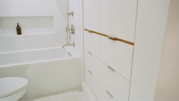
6. Minimalist Drawer Pulls
The cabinet hardware is Top Knobs Europa. These are some of the most minimal cabinet hardware on the market. They have a heavy feel, which is important as they will get lots of use and need to be durable. Despite the heft, I like them because they maintain minimal visual site lines.

Lines play a big role in any design. Being intentional about the lines found in your space creates a sense of unity and consistency that is associated with a high-end style.
From the drawer pulls to the floor tiles throughout the room, I really enjoyed the challenge of designing with a variety of scale in the lines. Playing with the scale of lines allows you to create balance and proportion in a space. Scale and symmetry expand a space, creating drama, depth, and evoking emotions of calm and consistency.
7. Stacked Tile
I wanted to juxtapose minimalist, clean, modern lines with a handcrafted touch in the tile selection for this shower. These tiles have a handmade tile texture, making them slightly imperfect, but they are installed in a modern stacked pattern. This allowed me to keep the minimalist lines I wanted but have the detail and warmth of the texture. Lighting the back wall showcases the surface of the tile. The door pulls give you just a glimpse of how much I enjoy geeking out on the play of linear elements in these modern minimalist bathroom designs.

8. Niche (matching tile dimensions)
Continuing the minimalist style into the shower, I added a niche. The dimensions of the niche were designed to prevent the need to cut any tiles down. This allowed us to keep clean, minimalistic lines as if we pushed back the wall in a perfect rectangle.

This shower niche is minimalist in both form and function. It allows the tub space to remain clutter-free, and the clean lines of the surrounding tile make it a piece of modern minimalist art.
9. Recessed Shower Curtain Track
How do you maintain a minimalist aesthetic with a shower curtain? In this bathroom, the glass-enclosed shower was simply not an option. This ceiling portion was drywall, so it became the perfect place to integrate a recessed curtail track. This design detail allows for a cleaner look while maintaining efficiency and practicality.

10. Shadow Gap with Wood Detail
The biggest changes happen in the tiniest details. I love how this shadow gap with the wood detail truly elevates the design of the cabinetry. It turned a sterile white cabinet into a piece of art. I intentionally repeated this design detail in other areas of the house.
As design principles, unity and repetition are essential to pulling of the modern minimalist style. Try using similar finishes and colors across the entire space. They don't have to be the same, but they should feel “unified” as you move through space. This design detail brings a sense of order and calm into a room.
Overall, I love seeing all these design details come together to create satisfying symmetry, a clean look, and a welcoming vibe. We all have ideas for how we want our home spaces to feel.
I hope reading through these details gave you the tools you need to begin thinking through your designs for your space. Elevate your ordinary, and remember to be intentional with even the tiniest design details. While they may seem small, those details often make the greatest impact in a space.
Stay Connected
Want more home ideas that will elevate your space and bring joy? Never miss a post by entering your email below. Follow @cokobostudio on Facebook and Instagram for photos, videos, and inspiration you can use in your home. Don’t forget to post your own space and tag us— we can’t wait to see what you’re working on.
