How to Create Your Remote Work Retreat: Kelli's Five Favorite Home Office Design Details
One of the biggest changes in the last few years was the shift to work-from-home culture. But even though more people are logging on from home, many don’t have home workspaces that create a sense of calm or encourage productivity.
A lot of home office spaces have the same issue: clutter. A tangled mass of wires shoved behind a desk, stacks of papers, and bulky tech (looking at you, printers) you have to stare at all day—even when off the clock. It’s unsurprising that reducing the amount of visual clutter can give a sense of calm and increase productivity throughout the day. When designing a home office, my goal is to minimize clutter but make everything easily accessible so you don’t miss a beat.
Five Home Office Design Details to Reduce Clutter and Increase Productivity
Working from home? Here are five design details that anyone can integrate into their space within a reasonable budget. Trust me, the investment to elevate your home office is well worth it!
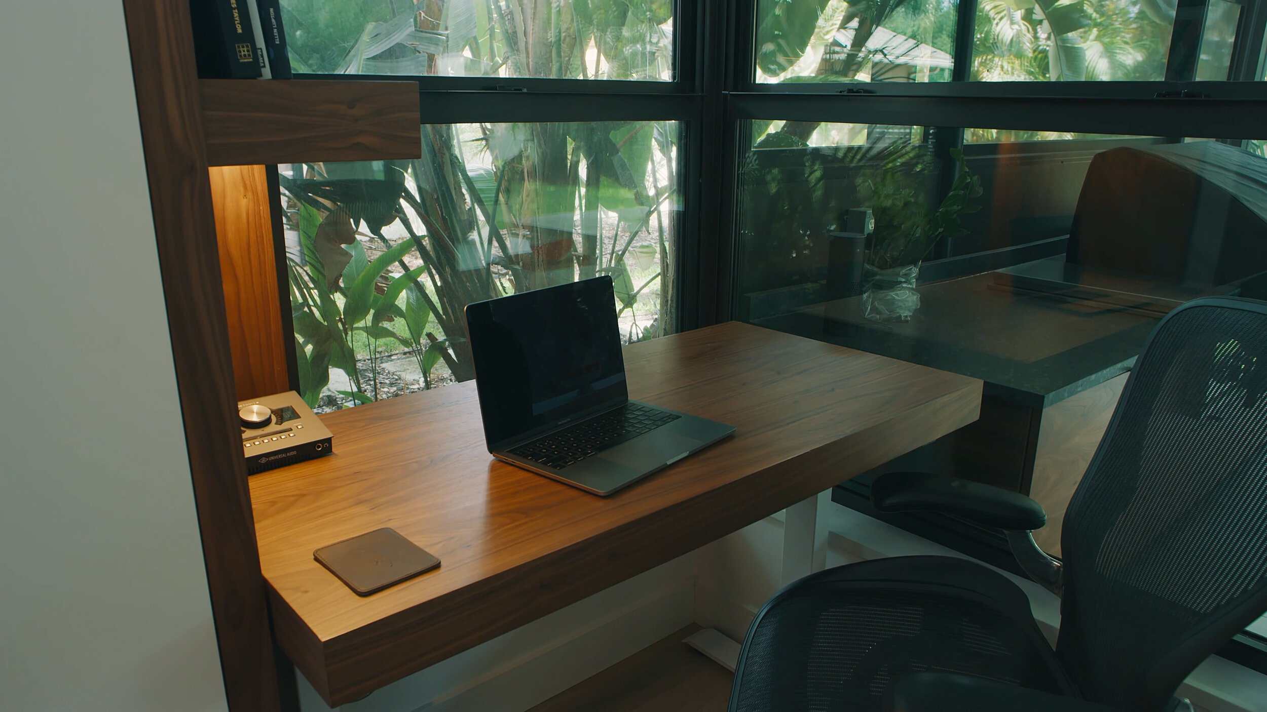
1. Integrated Task Lighting
This is a truly minimalist design detail as it is a movement away from adding more stuff and instead integrates without adding clutter. Minimalist designs, unlike many other design trends, serve both a functional and aesthetic need in this space.
While most desks need a task lamp, a traditional lamp is not always best for our workspaces. A cute lamp can add style but takes up desk space, which can be precious in smaller workspaces.
I love how this integrated lighting is both functional and beautiful in design. It showcases the wood features encasing the workspace. The location of the light allows for the entire surface area to be washed in light, illuminating a larger portion of the work surface than a traditional desk lamp.
I was able to integrate the lighting in a second home office space.
In this space, I positioned the desk where there was an abundance of natural light. The integrated task lighting is hidden beneath the floating wood shelves.
2. Hidden Printer Storage
Give thought to what you set out on a work surface. Prioritize only the items you absolutely need to leave out and make space to "hide" away all the rest. In this built-in office space, I was purposeful to hide away what can distract productivity. I hid the printer and other supplies in this cabinet tower - so everything would have a home.
Like a lot of home workspaces, this desk is used by both children and adults. These shared desks can easily take away from the elevated design in a room because of their lack of organization. By planning to have less out on the surface you will be more likely to keep the clutter under control.
3. Integrated Power and Hidden Wires Panel
There is nothing more nerve-wracking in a home office space than a nest of wires crisscrossing and balling up behind the desk. Not only is this tough to look at, but exposed wires also pose a risk of pulling tech off of the desk by getting stepped on. Thankfully, we can give them a home. Here I created a false wall (or backing) to keep wires hidden.
I also integrated the power strip into the desktop—because no one likes to climb under the desk to plug anything in. Concealing these cables creates fewer distractions and increases focus. With the absence of visible cords, your eyes are drawn to the well-lit natural wood accents that evoke a sense of calm and order.
4. Floor-to-Ceiling Cabinets
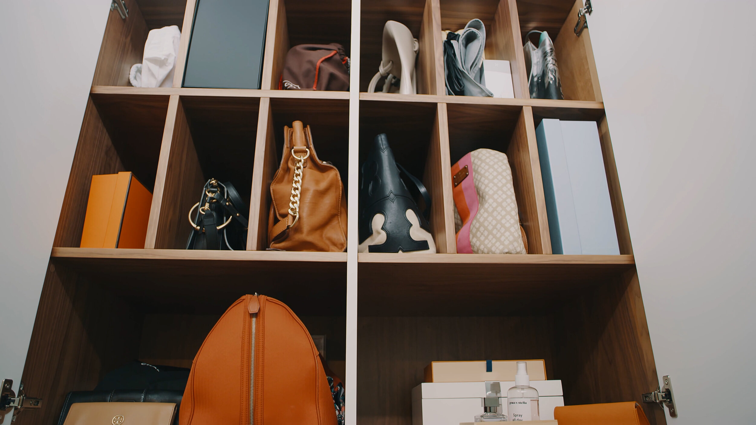
This den houses our built-in desk and is a shared living space adjacent to both the dining room and kitchen. Floor-to-ceiling cabinets are the perfect storage solution when designing a small shared space like this—especially one located in a home with an open floor plan.
The cabinets on the back wall allow the family to easily hide away work and home essentials so they do not become an eyesore when entertaining guests or working in the kitchen. The “tower” of cabinets that houses the hidden printer helps to tuck the desk away from viewpoints as well.
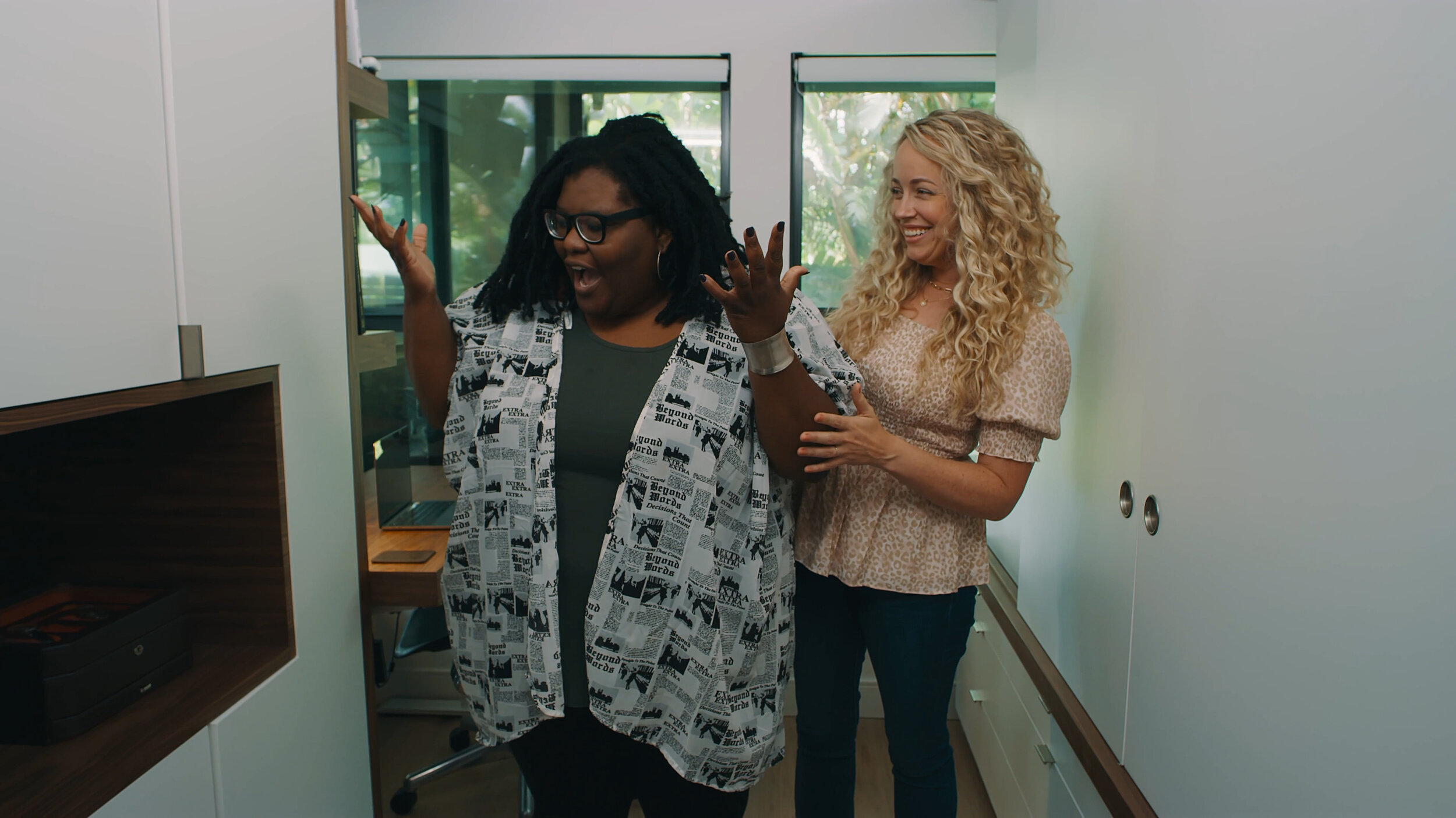
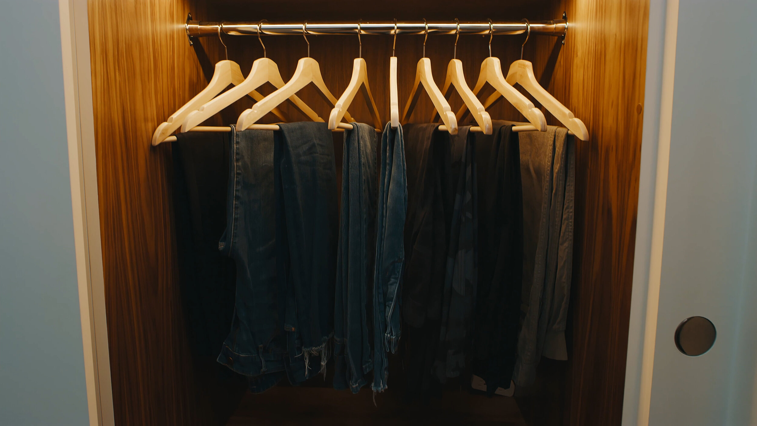
In the second home office space, I used floor-to-ceiling cabinets again. This office space is located in the primary bedroom closet so the cabinets serve two purposes: they store the homeowner’s clothes and create a clean, sophisticated backdrop for video meetings.
I used white cabinetry with polished nickel hardware in this space and incorporated walnut. I wanted to make sure the finishes were consistent with the rest of the house, carrying a sense of welcoming while remaining high-end and refined. This unity of design creates a sense of calm within the house. The white color of the built-ins blends into the wall, making the room appear larger and the ceiling higher. The color, heights, and location of the cabinets elevate the viewpoints of the room.
5. Open Shelving
One requirement when planning out this home was the need to create multiple work-from-home spaces. I used these open shelves in the workspace located right off the primary bedroom in the closet. It may sound crazy, but the design came out great!


You can see a full reveal of this space in this episode.
The open walnut shelves compliment the design in the cabinetry surrounding the work area. The use of materials like these invites the calm and open feeling of the outdoors into the work area, and the design of the shelves provides additional storage so the desktop can remain free of clutter.
More Home Office Details
Want to see more details from these home office designs? Click the link below and check out my Creating Cokobo episode all about these work-from-home spaces. I would love to see how you are creating a little Cokobo in your workspace! Sign up for cokobo.com emails. Post and share what you are doing on your social and tag us @cokobostudio.


